The Tooling Kit
Helping teams ship faster and more scalable products


Overview
Tooling at THG was an erratic, often low quality, end-user experience, which was due to siloed development squads, more back-end focused, creating inconsistent user interfaces with scalability and accessibility issues; This lead to negative feedback from stakeholders across the business. Our task was to create parity across our tooling with the introduction of standardised components and later a full design system.
Client
THG
Services
UX Design
Categories
Design systems
Delivered
Component library of 52+ components.
Scalable documentation and style guide.
Modern app shell, adaptive across devices.
40+ migrated features.
Roadmap, including usage tracking and more.
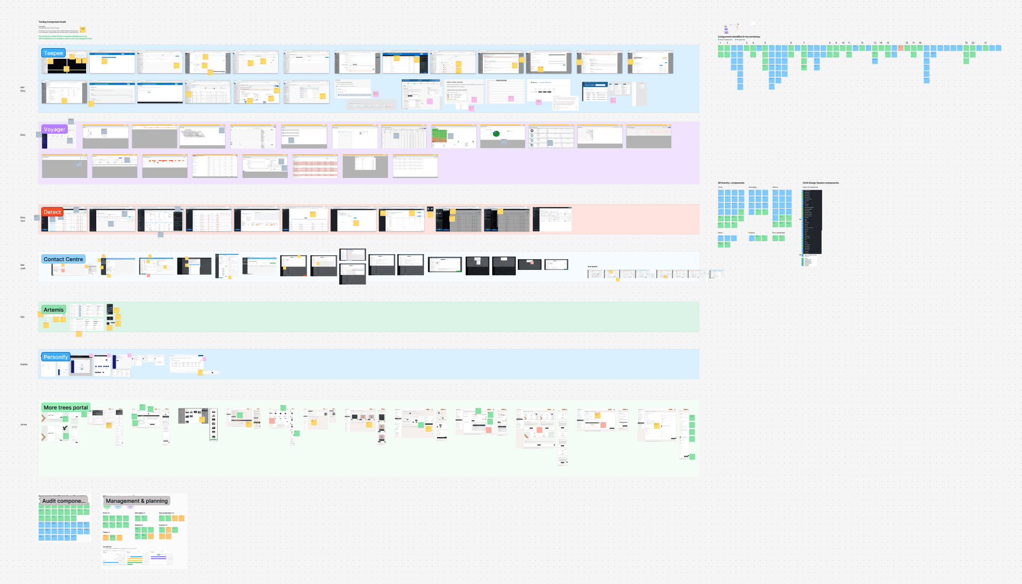
Auditing
We audited our most popular tooling applications. We were looking at patterns in the use of components including commonality and quality of their implementation. We used these metrics to determine a roadmap for our component library.
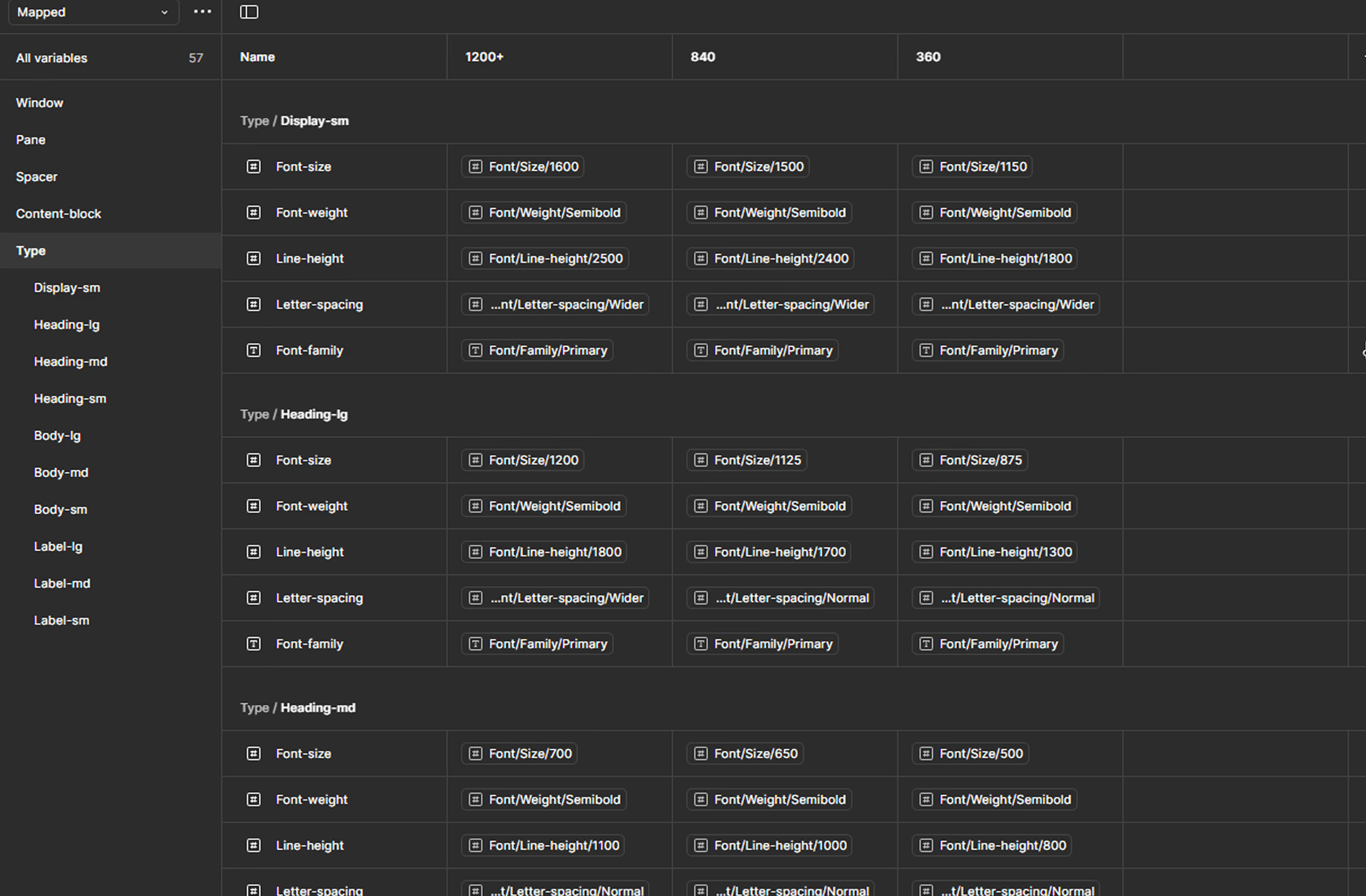
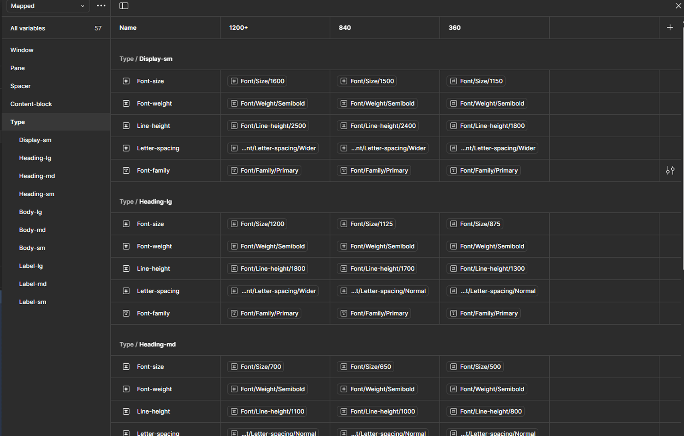
Foundations
We established primitive values withing Figma for all styling properties including colour, type, layout, depth and motion. Then we translated them into semantic variables to maintain consistency, keeping the UI scalable, and future-proof.

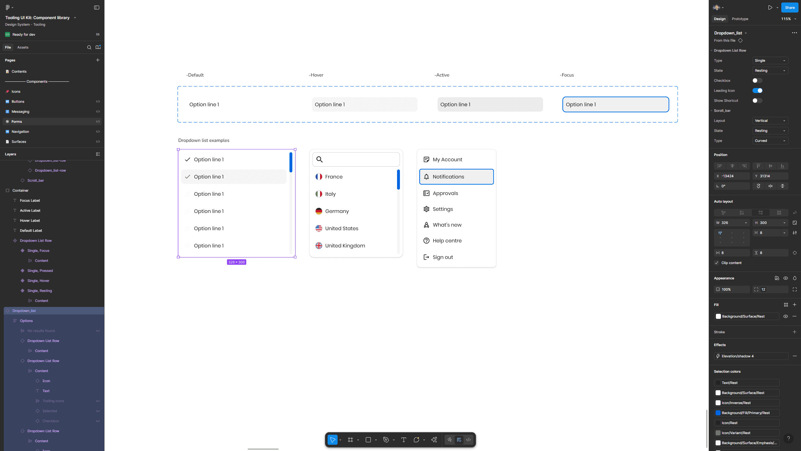
Component library
Our component design process followed a structured sprint, beginning with competitor analysis workshops to identify industry best practices and modular properties. Designers adhered to a standardised checklist to ensure principles were properly implemented. Each component underwent rigorous peer review, focusing on checklist compliance, accessibility and feasibility. When appropriate, components were also incorporated into user testing but could be developed beforehand. Each stage (research & design, peer review, validation and feasibility) contributed to increasing the design's confidence score by 25%, ensuring a high level of quality and usability.
We established a code-based component library accessible online for wider adoption by our teams, we also leveraged auto-generative plugins, enabling near-instant documentation within Figma.


Patterns
As we developed components, the next logical step in enhancing design-development operations was to establish standardised patterns. For example, we created table variations with bulk editing, different row heights, and advanced search and filtering capabilities. We also designed patterns for larger features, such as notifications, to serve as reusable baseline for both developer and designer. Everything properly nested with booleans for better designOps.
The developer's experience
With our initial component library built, we realised there were some problems with its implementation. It was clear we put too much focus on components as developers were still making mistakes despite a more cohesive user interface, so, through observation and a business-wide survey we found insights to build more sufficient resources, including proper onboarding, usage, formatting rules, accessibility online without Figma or VPN, proper component documentation within storybook, framework agnositc and an improved roadmap.
Insights


App shell update
Many tooling projects disregarded responsive design, we established a more optimised appshell and console, this would prove especially beneficial with tooling on smaller devices becoming more appealable e.g., warehouse and in store operations.
Next steps
Our design system is a continuos project, and we are working to implement new features and processes on the roadmap. We are looking at adoption rate, usage analytics, linting, AI, MCP integrations and more.